BeMob Chart is a graphical view of tabular data. It is aimed to visualize the performance of your advertising campaigns.
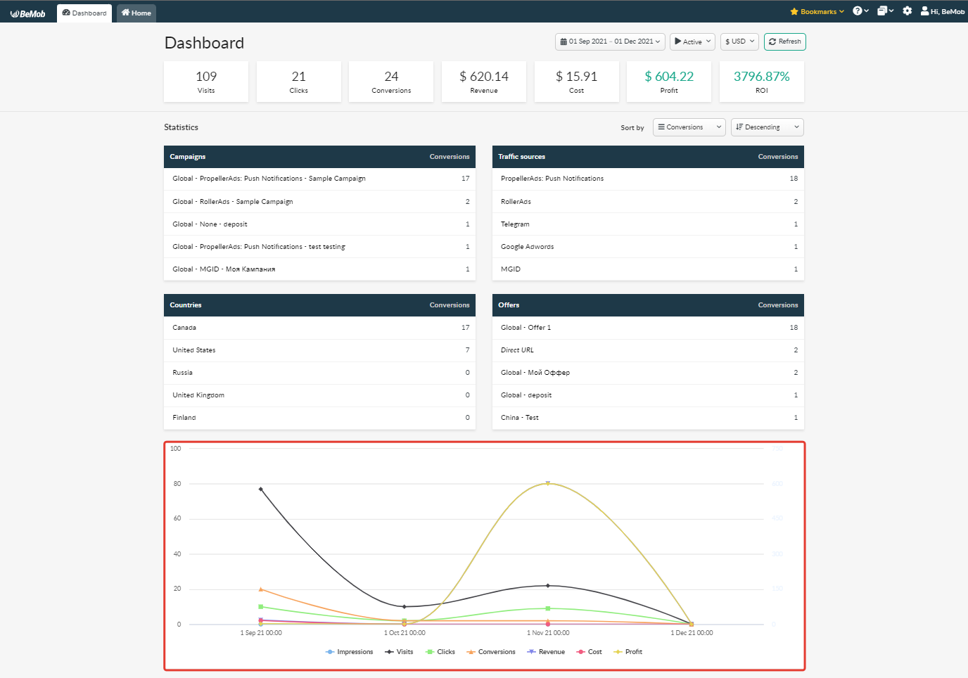
To see the chart that correlates to the general report of your BeMob account go to Dashboard.
The chart will be available at the bottom of the page.
To open the chart of a regular report:
- access the required tab;
- click Chart icon on the panel.
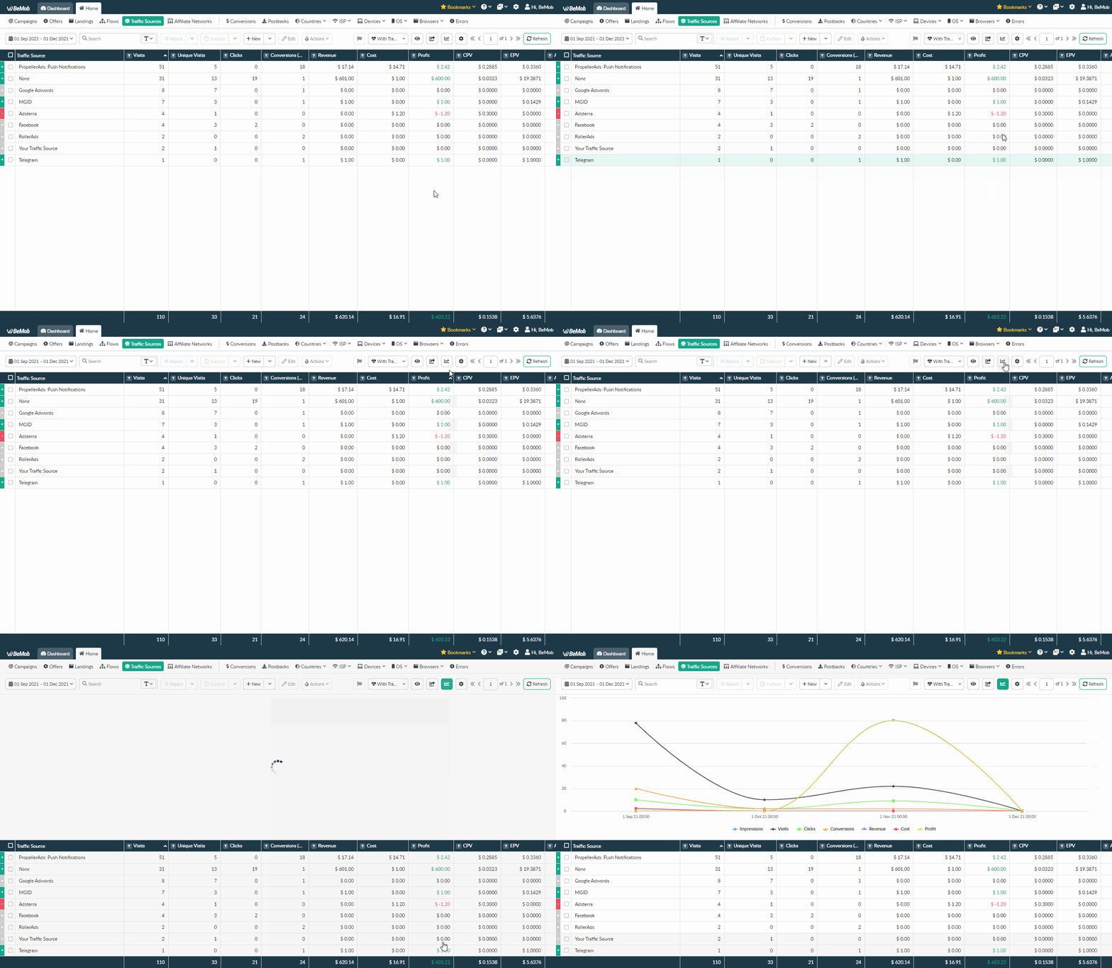
The chart is available under the all tabs except Conversions, Postbacks, Live Visits/Live Clicks and Errors since these reports don't include any quantitative metrics.
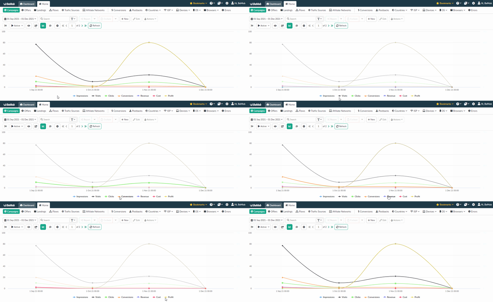
BeMob chart consists of two axes: horizontal axis (period of time) and vertical axis (numbers).
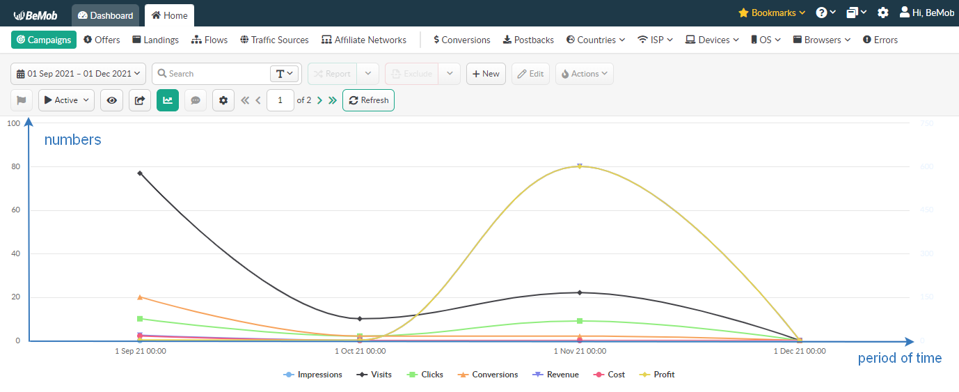
The chart displays information as a series of data points connected by lines. It shows a dependency between data points and a particular period.
Data points are quantitative values: Impressions, Visits, Clicks, Conversions, Revenue, Cost and Profit.
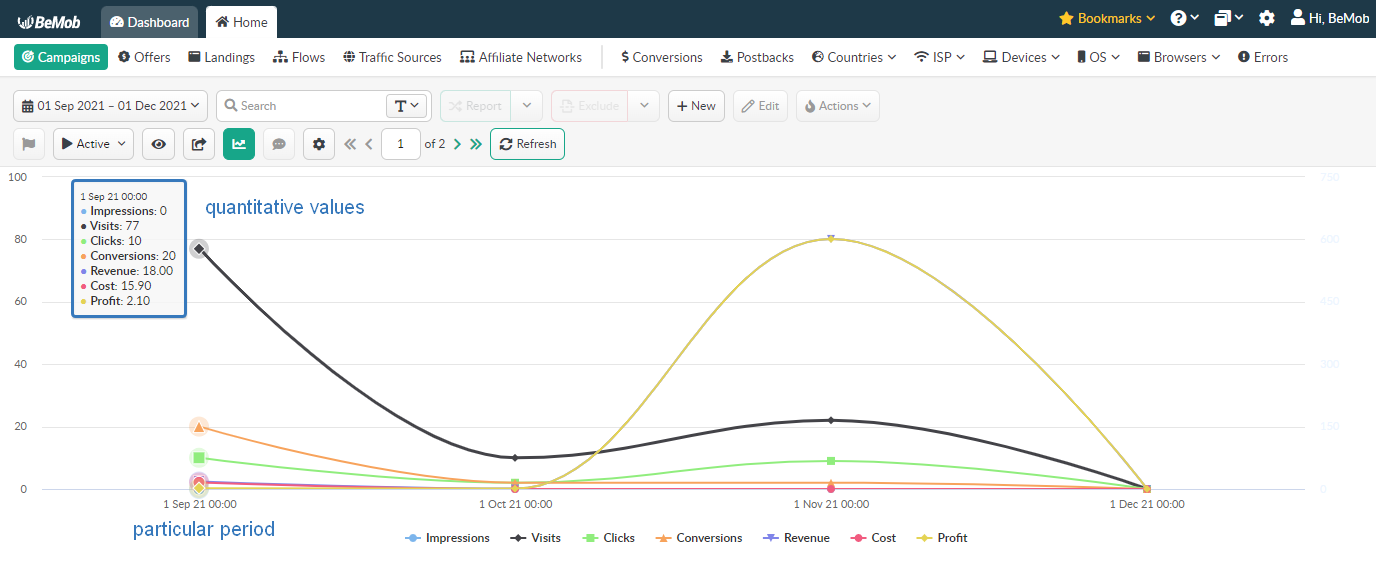
Each quantitative value has its own line painted in a certain color.
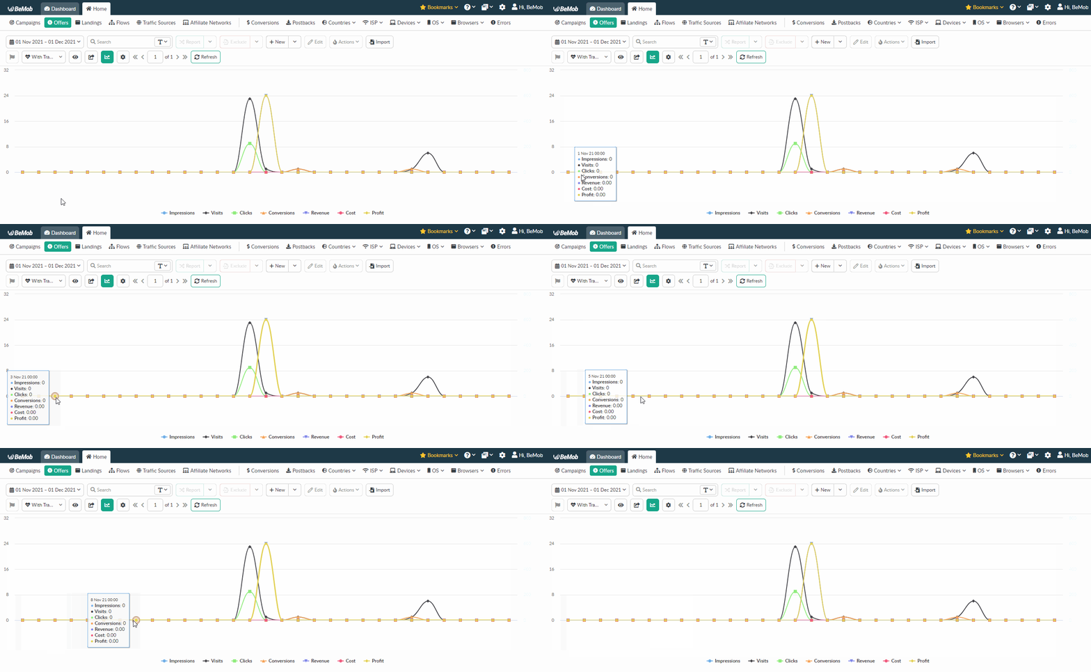
If you select a period of time that includes 35 days or less, the chart will display statistics by day.
For instance, if you select the period from 01 Nov 2021 to 01 Dec 2021, the corresponding data will be displayed for each day of the selected periof of time.
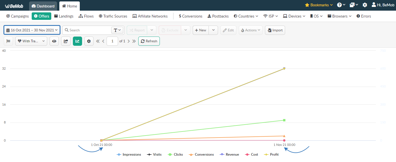
If you select a period of time that includes 35 days or more, the chart will be generated the following way: from the first day of the primarily selected month to the first day of the month selected last.
For instance, if you select the period from 16 Oct 2021 to 30 Nov 2021, the corresponding statistics will be displayed as the data line from 01 Oct 2021 to 01 Nov 2021.
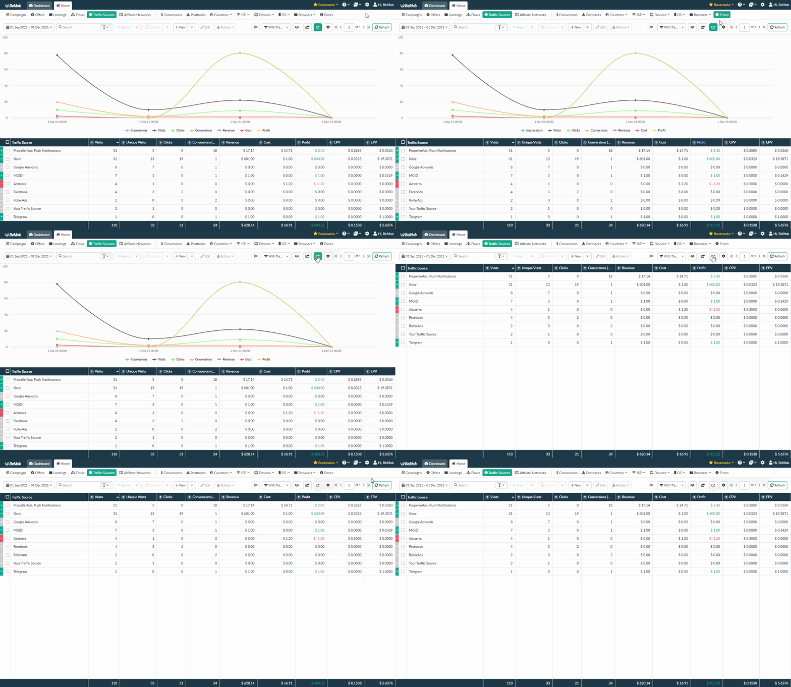
To close the chart click Chart icon again.
If you have any questions or need the assistance with the settings, contact our support team through the live chat or at support@bemob.com